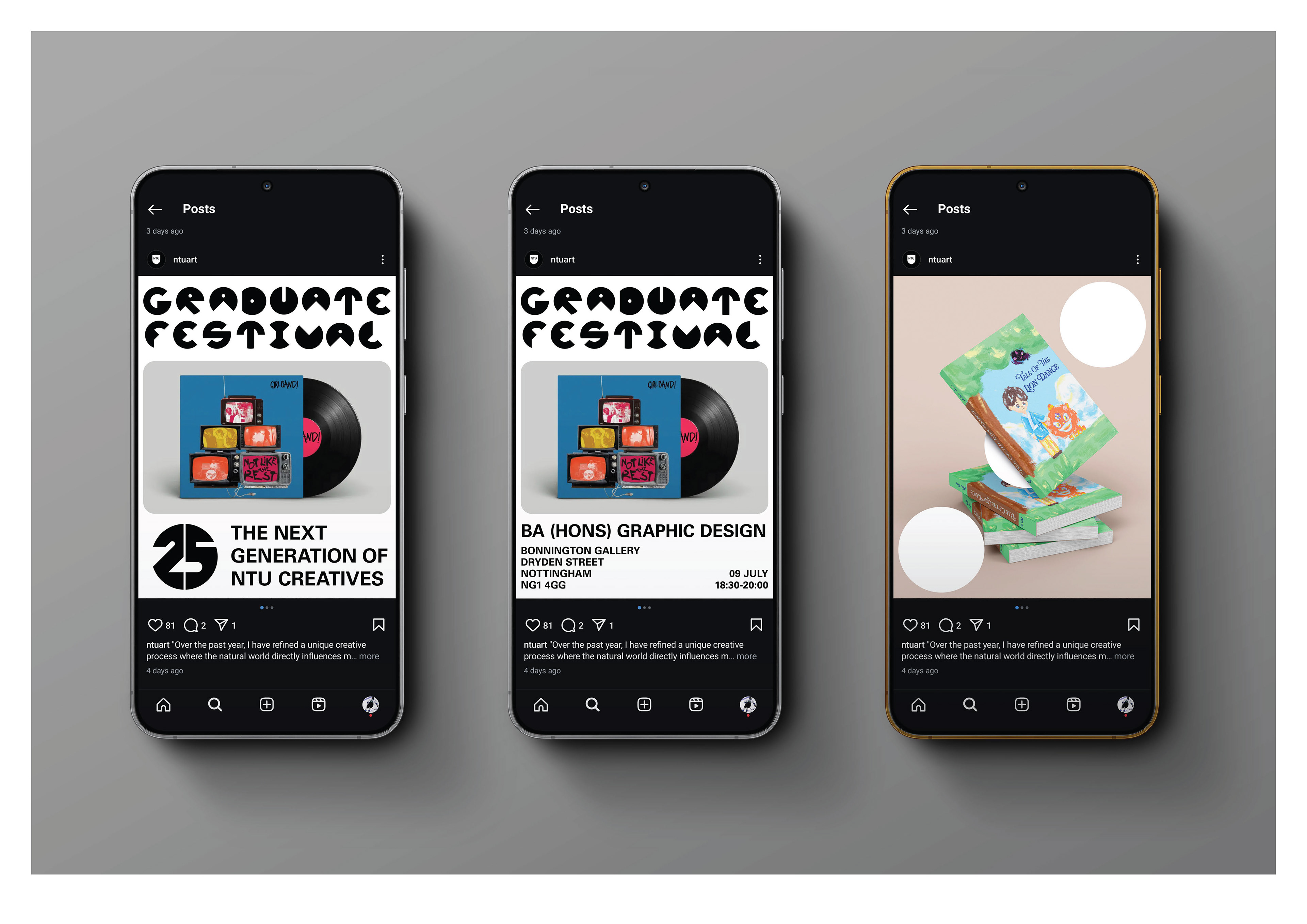
Problem:
The Nottingham School of Art & Design needed to refresh their graduate festival campaign to better celebrate the students and the school. They needed a dynamic identity that would work in a variety of contexts, and keep the students as the focus throughout.
Solution:
Communicating the catalytic abilities of NTU’s creative change makers and how they push the dominoes of innovation forwards. The black and white shapes of dominoes will add to the existing identity and form the base grid of all deliverables.
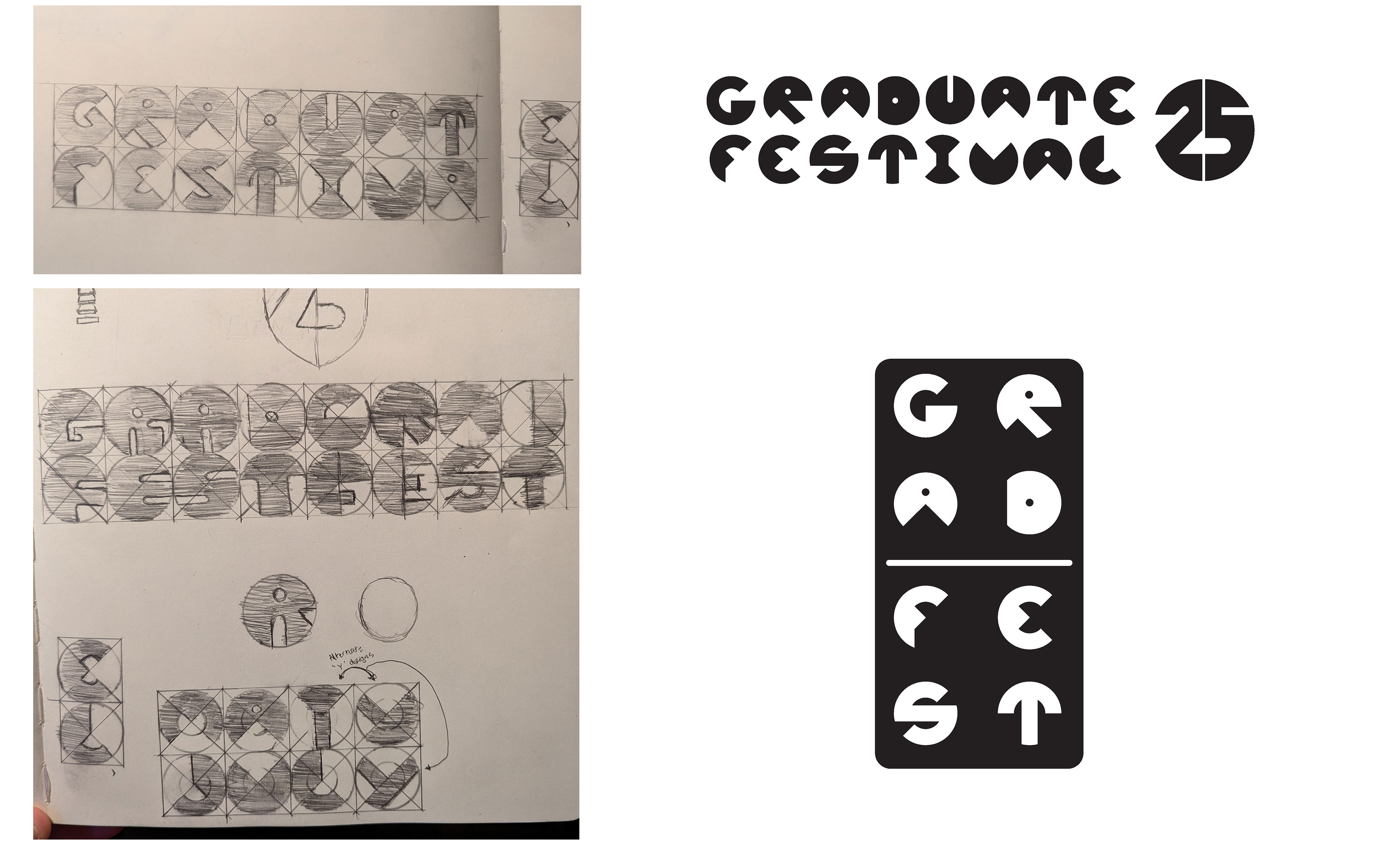
The existing Univers typeface that the school was using was quite a bland sans-serif, and did not match the creativity and catalytic abilities of the students. I made a custom display font through cutting away at solid circles to tie in with the dots theme.
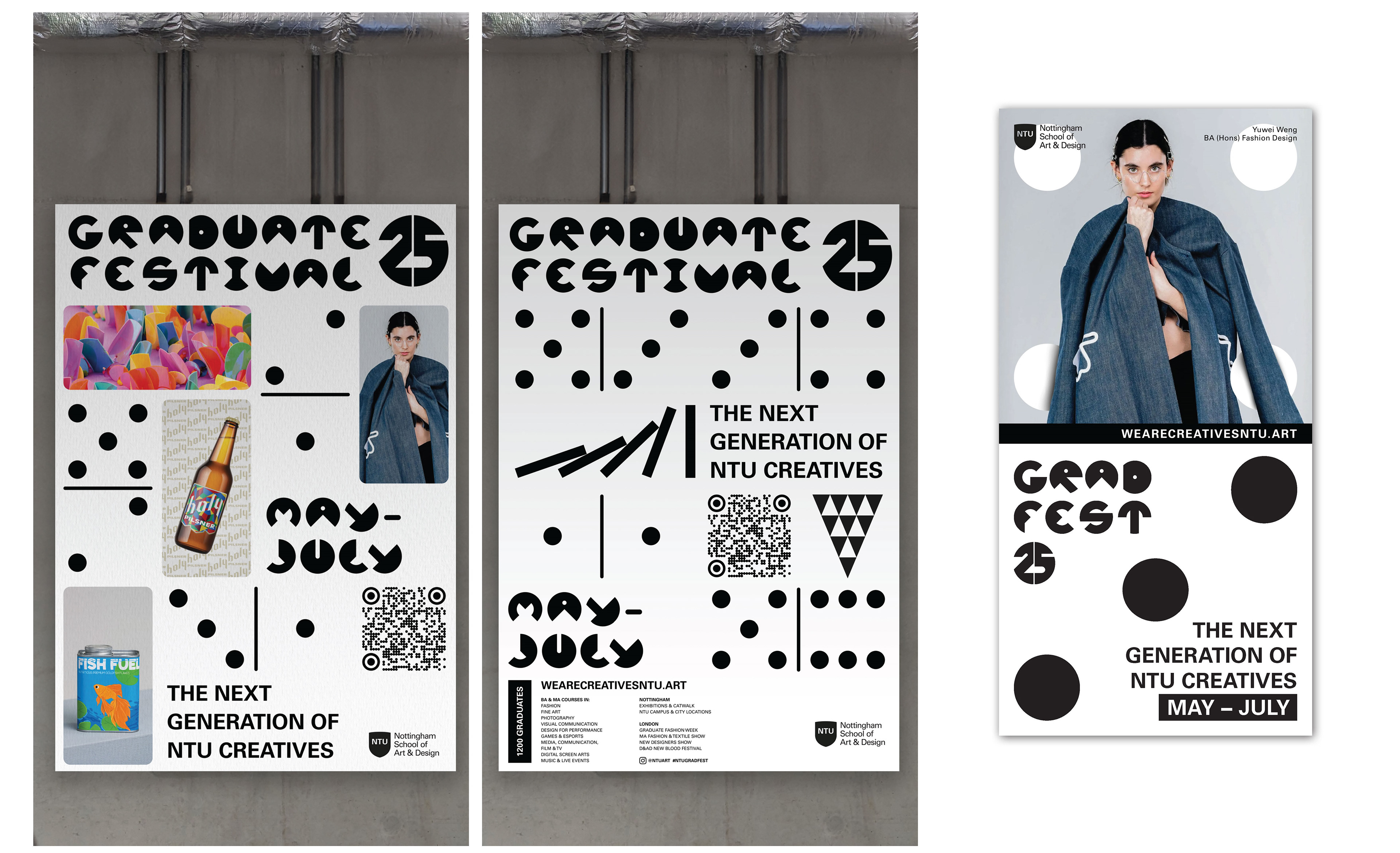
The invite is made to be the same height as A5, but is cut into the same 2:1 aspect ratio as a domino.
I also integrated dots into the student work to tie it together.
I also integrated dots into the student work to tie it together.